Smithsonian
Everything Under the Sun — Brand Update 2018
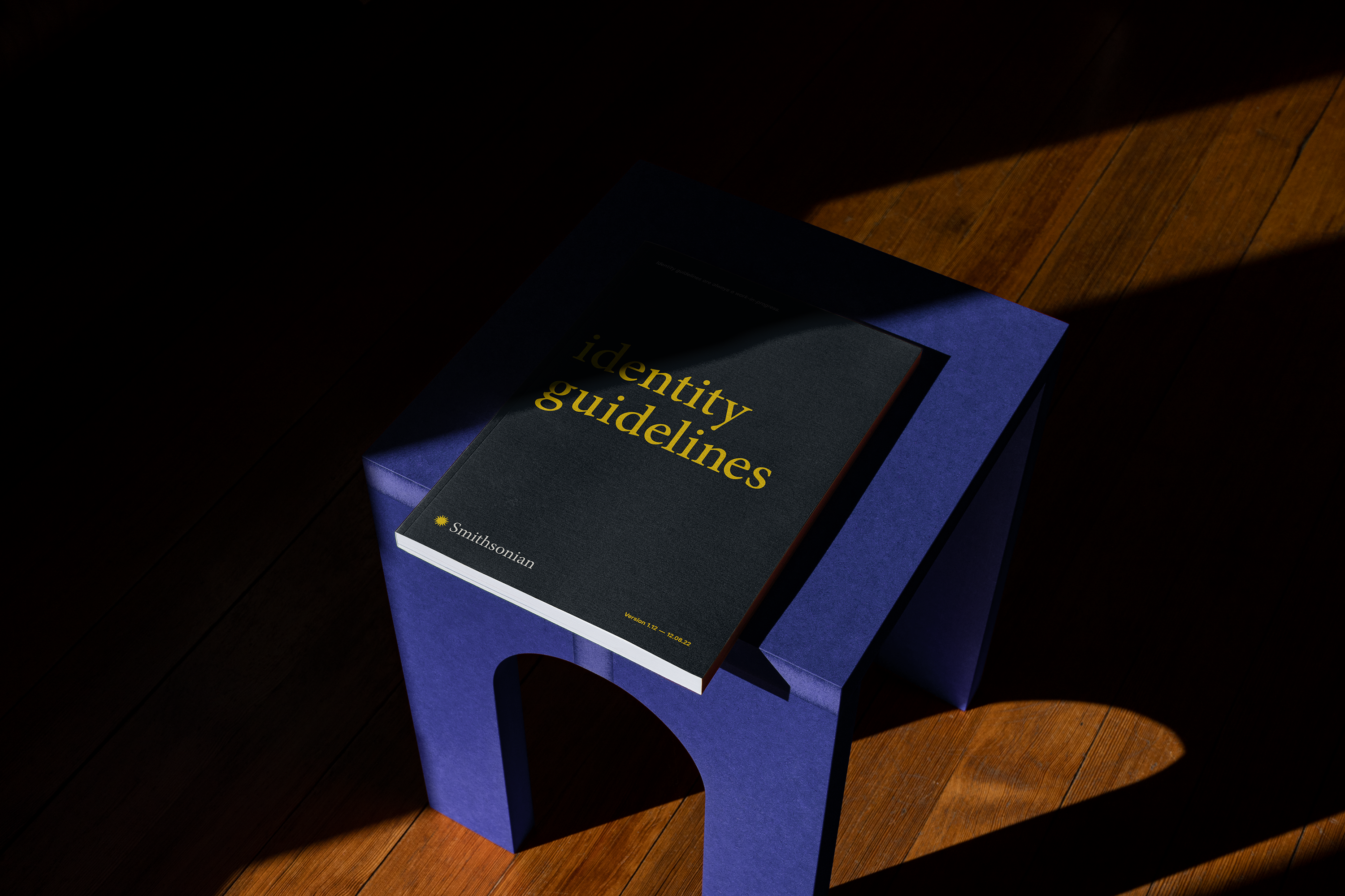
Updating a brand with 1 billion annual impressions is no small task. Greg Fisk worked with the Smithsonian Institution to bring their visual identity up to speed with new communication forms that weren’t prevalent when the logo was last visited in 1998. From creating a logo design system to writing a comprehensive brand guide, Greg brought new ideas and rules to life with the goal of making a flexible and enduring brand for years to come.
Branding


EVERYTHING UNDER THE SUN
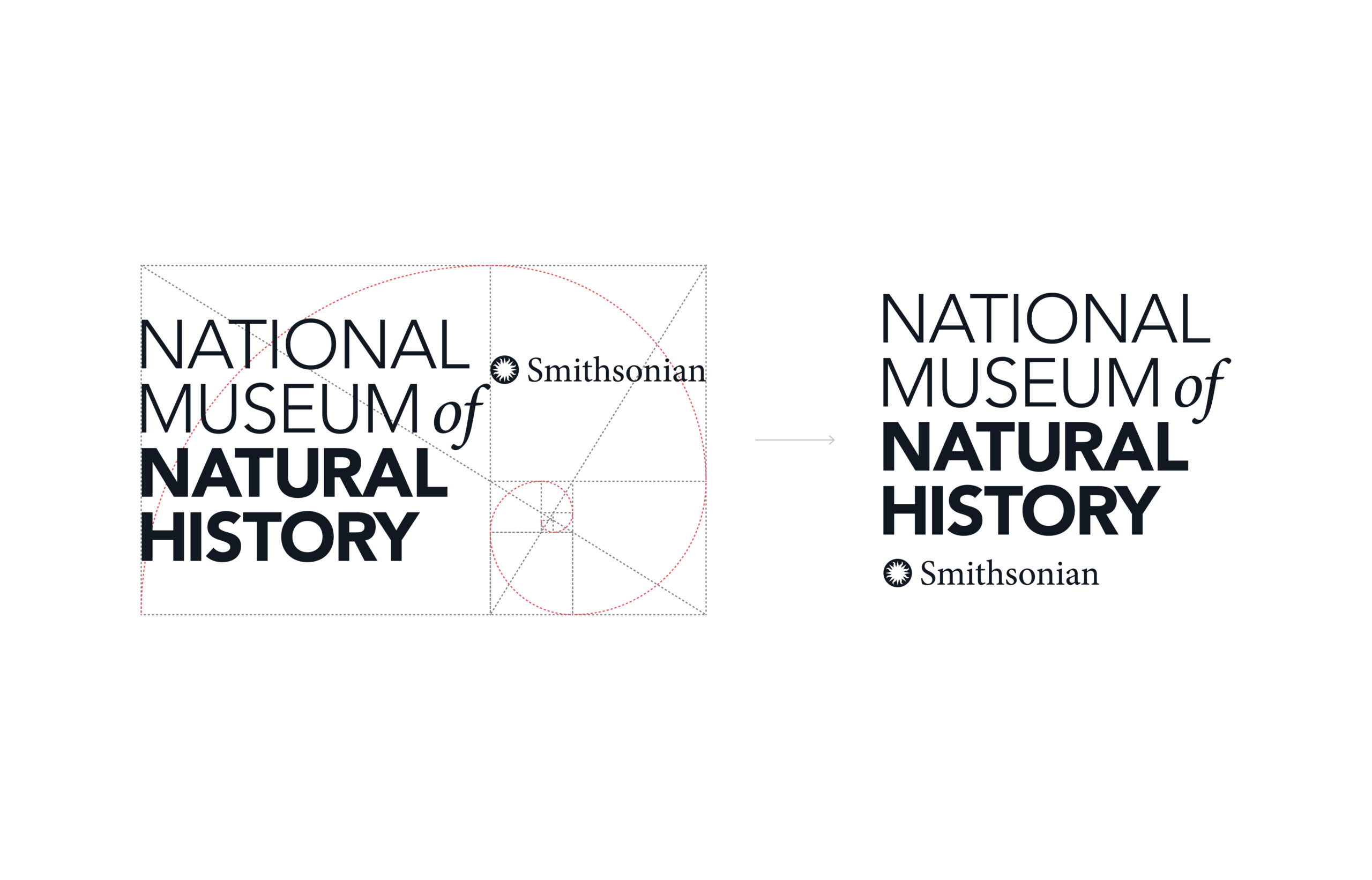
One of the biggest changes was the newly added margin around the sun. The visual tension where the sun touched the sky was making the logomark difficult to see. Adding just a little margin allowed the sun to shine and made the logomark easier to recognize when treated small. It was also a strategic choice to remove the word “institution” from the primary logo lockup. Several studies were done in order to arrive at the conclusion that logomark recognition was at 2-3% without the inclusion of the word Smithsonian.


CO-BRANDING INITIATIVE
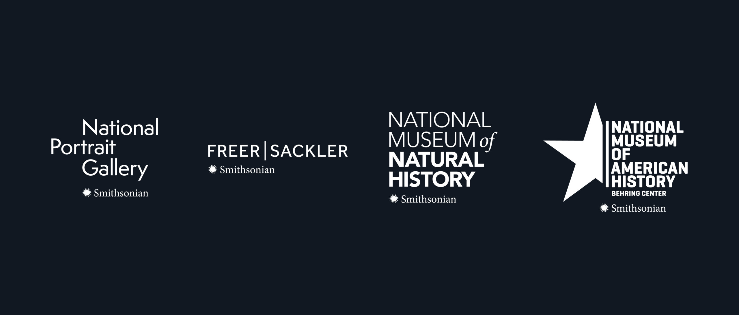
To strengthen brand recognition across the entire institution, Greg developed a cohesive visual system rooted in co-branding. This new set of guidelines was designed to unify over 20 museums and research centers under one clear identity. By thoughtfully integrating each museum’s unique brand with the Smithsonian’s, the system reinforces the institution’s presence while respecting individual identities. As it turns out, the golden ratio offered the perfect framework to establish a balanced and visually harmonious relationship between the two.
More work
bimmabranding

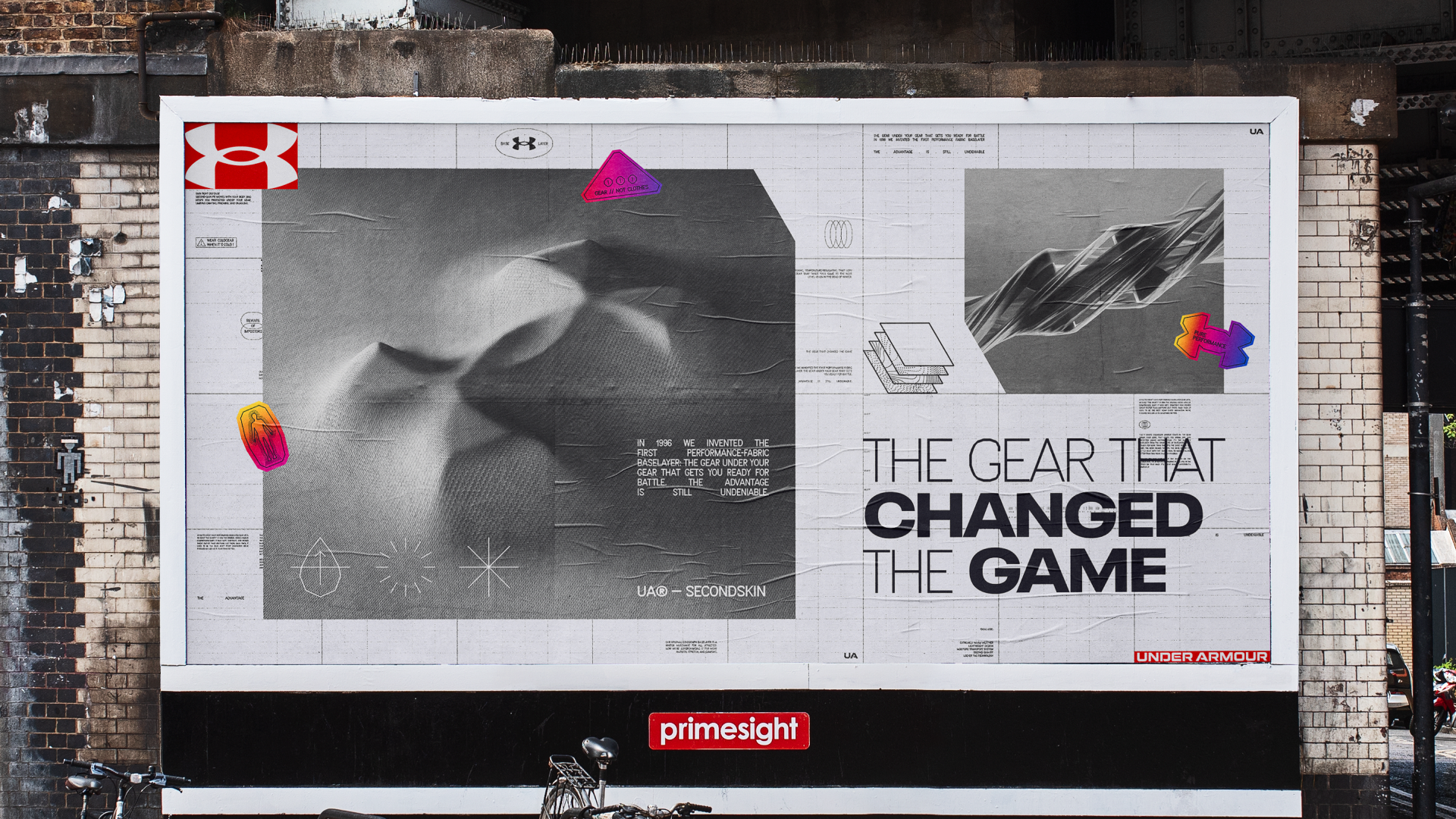
Under Armourmotion graphics, video

Dog PPLBranding

Microsoft Innovation Labsmotion graphics, video

BeyondCorporate Design
Baselayerbranding
HPEmotion graphics, video
Google I/OProject type
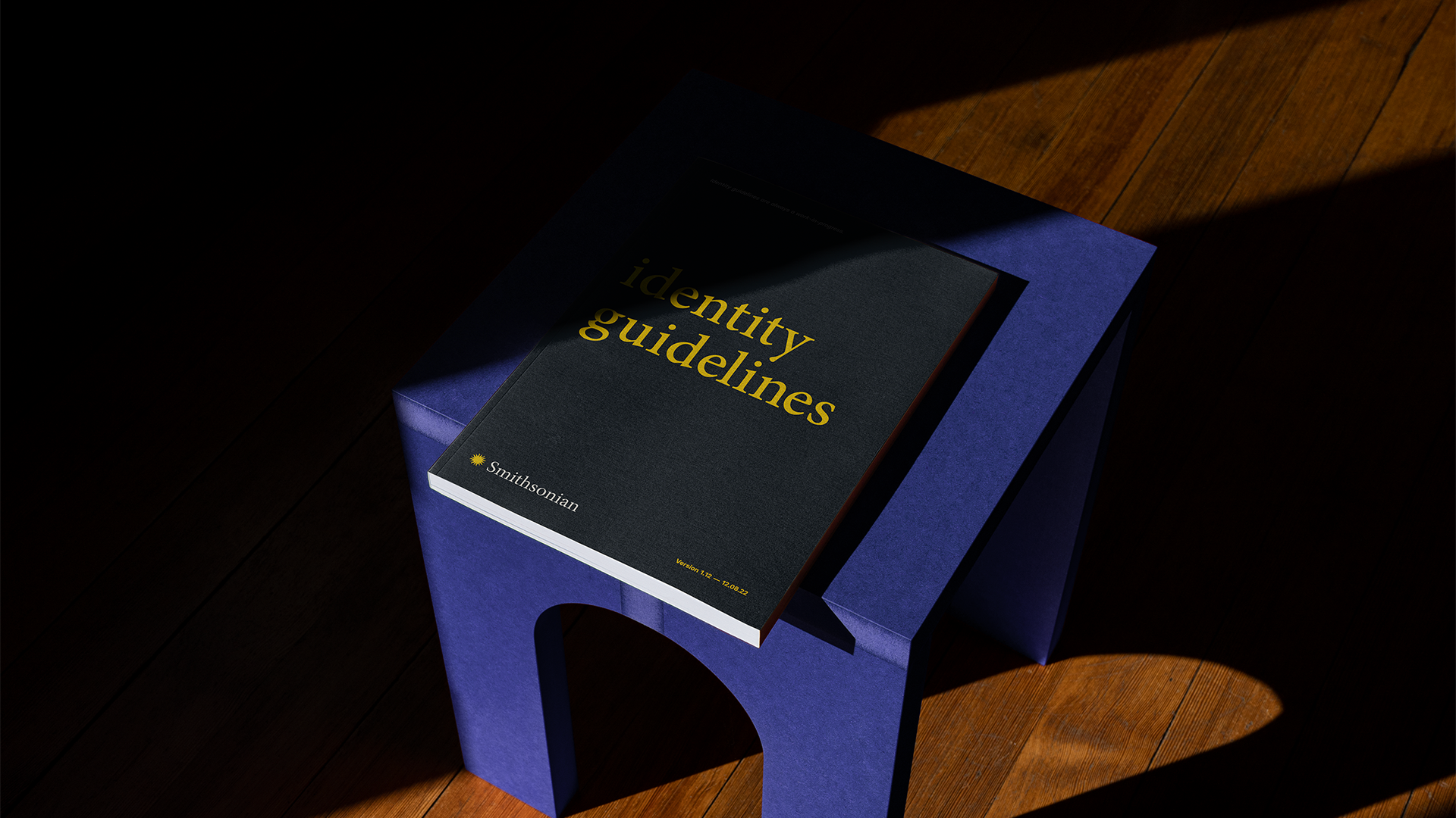
SmithsonianBranding

Spin Controlmotion graphics, video, branding

Good GirlMusic
Resilience MuralEnvironmental
Style Engineui/ux
Wanna start a project? Say less.
Email /
greg@thorough.studio
Instagram /
@thorough_studio
© THOROUGH_STUDIO 2026
Branding and motion design studio.